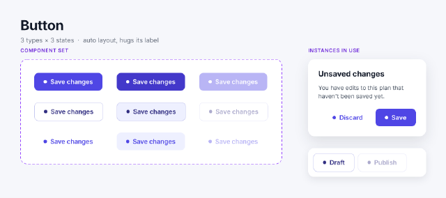
Button Component Set
A button component set with nine variants — Primary, Secondary and Ghost across Default, Hover and Disabled — and instances switched by property.
1 page; 51 layers; 1060 × 470 design
Kit 07 / 16 · 10 samples · 5 categories
Interface design and prototyping: frames, auto layout, components, variants and constraints. Saved as .kdesign.
saved → sales-analytics-dashboard.kdesign ✓139 commands · 136 ms
select.allnode.set(ids, props)node.create(type, parent, name, width…)node.create(type, parent, name, props)node.create(type, parent, name, width…)text.create(text, x, y, parent, props)A button component set with nine variants — Primary, Secondary and Ghost across Default, Hover and Disabled — and instances switched by property.
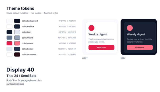
A design-system tokens page — colour variables with Light and Dark modes bound to swatches and to one card shown in both modes, plus a type scale of text styles.
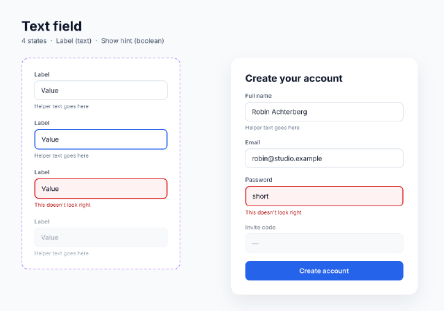
A text-field component set with Default, Focused, Error and Disabled variants, a text property for its label and a boolean for its hint, used in a sign-up form.
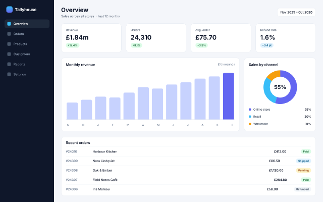
A 1440 × 900 desktop dashboard — sidebar navigation, KPI cards that share the width, a bar chart from auto-layout columns, a donut from arc ellipses and an orders list.
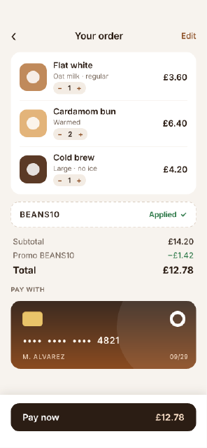
A mobile checkout — cart lines with steppers, a promo field, a totals block with space-between rows, a saved card drawn with boolean shapes and a sticky pay bar.
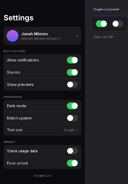
A dark-theme mobile settings screen of grouped lists, built from a Toggle component with On and Off variants and a reusable list-row layout.
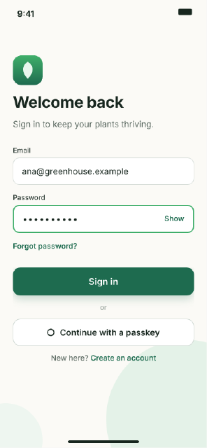
A mobile sign-in screen built entirely with nested auto layout — fill-width inputs, a hugging button row and a centred footer link.
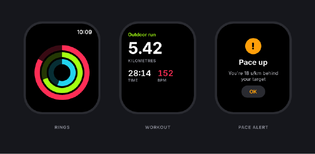
Three smartwatch screens for a running app — activity rings from arc ellipses, a live workout readout and a pace alert — on a dark presentation board.
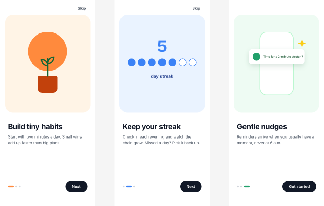
A three-screen onboarding carousel wired as a prototype — Next buttons push to the following screen, Skip jumps to the end, and a flow starts on the first.
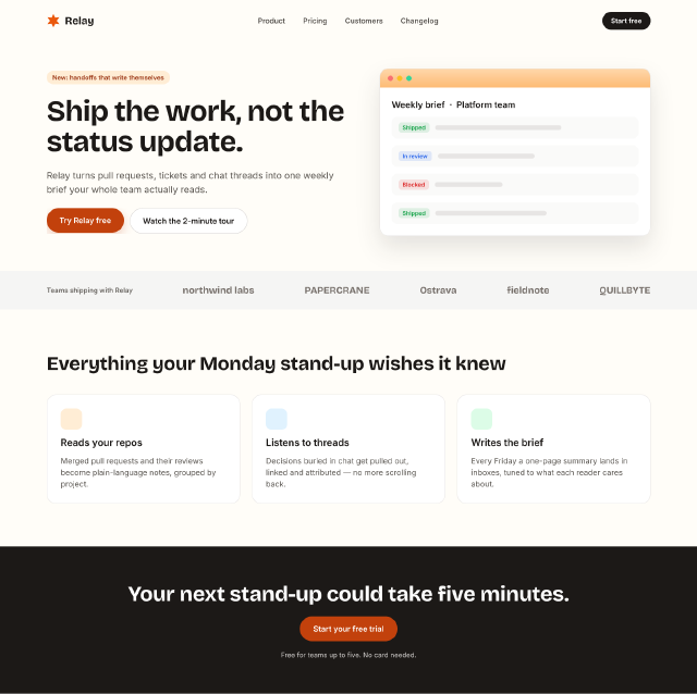
A 1440 px marketing page — navigation, hero with a product mock, a customer strip, three feature cards in a wrapping row and a closing call to action.