Button Component Set
A button component set with nine variants — Primary, Secondary and Ghost across Default, Hover and Disabled — and instances switched by property.
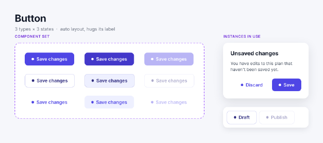
Nine main components named `Type=…, State=…` — each a horizontal auto layout frame hugging a dot and a label — are combined into one component set with `component.combineVariants`, which turns the names into two variant properties. The set itself is laid out as a 3 × 3 grid. On the right, instances of the set build a confirmation dialog and a toolbar: `instance.setProperties` switches them to the Ghost or Secondary type and the Disabled state, and their labels are text overrides.
Steps
60 commandssteps:
- { command: select.all, params: {}, as: initial }
- { command: node.set, params: { ids: [$initial.selection.0], props: { name: Buttons, fill: "#F6F7FB" } } }
- { command: frame.create, params: { x: 0, y: 0, width: 1060, height: 470, parent: $initial.selection.0, name: Board, props: { fill: none } }, as: board }
- { command: text.create, params: { text: Button, x: 48, y: 40, parent: $board.id, props: { fontFamily: Inter, fontStyle: Bold, fontSize: 32, fills: ["#111827"] } } }
- { command: text.create, params: { text: "3 types × 3 states · auto layout, hugs its label", x: 48, y: 86, parent: $board.id, props: { fontFamily: Inter, fontStyle: Regular, fontSize: 15, fills: ["#6B7280"] } } }
- { command: node.create, params: { type: component, parent: $board.id, name: "Type=Primary, State=Default", x: 40, y: 600, props: { layout: horizontal, padding: [12, 22, 12, 22], gap: 8, cornerRadius: 10, sizingH: hug, sizingV: hug, crossAlign: center, fill: "#4F46E5" } }, as: v0 }
- { command: node.create, params: { type: ellipse, parent: $v0.id, name: Icon, width: 8, height: 8, props: { fill: "#FFFFFF" } } }
- { command: text.create, params: { text: Save changes, x: 0, y: 0, parent: $v0.id, props: { fontFamily: Inter, fontStyle: Semi Bold, fontSize: 15, fills: ["#FFFFFF"] } } }
- { command: node.create, params: { type: component, parent: $board.id, name: "Type=Primary, State=Hover", x: 50, y: 600, props: { layout: horizontal, padding: [12, 22, 12, 22], gap: 8, cornerRadius: 10, sizingH: hug, sizingV: hug, crossAlign: center, fill: "#4338CA" } }, as: v1 }
- { command: node.create, params: { type: ellipse, parent: $v1.id, name: Icon, width: 8, height: 8, props: { fill: "#FFFFFF" } } }
- { command: text.create, params: { text: Save changes, x: 0, y: 0, parent: $v1.id, props: { fontFamily: Inter, fontStyle: Semi Bold, fontSize: 15, fills: ["#FFFFFF"] } } }
- { command: node.create, params: { type: component, parent: $board.id, name: "Type=Primary, State=Disabled", x: 60, y: 600, props: { layout: horizontal, padding: [12, 22, 12, 22], gap: 8, cornerRadius: 10, sizingH: hug, sizingV: hug, crossAlign: center, fill: "#4F46E5", opacity: 0.4 } }, as: v2 }
- { command: node.create, params: { type: ellipse, parent: $v2.id, name: Icon, width: 8, height: 8, props: { fill: "#FFFFFF" } } }
- { command: text.create, params: { text: Save changes, x: 0, y: 0, parent: $v2.id, props: { fontFamily: Inter, fontStyle: Semi Bold, fontSize: 15, fills: ["#FFFFFF"] } } }
- { command: node.create, params: { type: component, parent: $board.id, name: "Type=Secondary, State=Default", x: 70, y: 600, props: { layout: horizontal, padding: [12, 22, 12, 22], gap: 8, cornerRadius: 10, sizingH: hug, sizingV: hug, crossAlign: center, fill: "#FFFFFF", stroke: "#C7C9F0", strokeWeight: 1 } }, as: v3 }
- { command: node.create, params: { type: ellipse, parent: $v3.id, name: Icon, width: 8, height: 8, props: { fill: "#312E81" } } }
- { command: text.create, params: { text: Save changes, x: 0, y: 0, parent: $v3.id, props: { fontFamily: Inter, fontStyle: Semi Bold, fontSize: 15, fills: ["#312E81"] } } }
- { command: node.create, params: { type: component, parent: $board.id, name: "Type=Secondary, State=Hover", x: 80, y: 600, props: { layout: horizontal, padding: [12, 22, 12, 22], gap: 8, cornerRadius: 10, sizingH: hug, sizingV: hug, crossAlign: center, fill: "#EEF0FF", stroke: "#C7C9F0", strokeWeight: 1 } }, as: v4 }
- { command: node.create, params: { type: ellipse, parent: $v4.id, name: Icon, width: 8, height: 8, props: { fill: "#312E81" } } }
- { command: text.create, params: { text: Save changes, x: 0, y: 0, parent: $v4.id, props: { fontFamily: Inter, fontStyle: Semi Bold, fontSize: 15, fills: ["#312E81"] } } }
- { command: node.create, params: { type: component, parent: $board.id, name: "Type=Secondary, State=Disabled", x: 90, y: 600, props: { layout: horizontal, padding: [12, 22, 12, 22], gap: 8, cornerRadius: 10, sizingH: hug, sizingV: hug, crossAlign: center, fill: "#FFFFFF", stroke: "#C7C9F0", strokeWeight: 1, opacity: 0.4 } }, as: v5 }
- { command: node.create, params: { type: ellipse, parent: $v5.id, name: Icon, width: 8, height: 8, props: { fill: "#312E81" } } }
- { command: text.create, params: { text: Save changes, x: 0, y: 0, parent: $v5.id, props: { fontFamily: Inter, fontStyle: Semi Bold, fontSize: 15, fills: ["#312E81"] } } }
- { command: node.create, params: { type: component, parent: $board.id, name: "Type=Ghost, State=Default", x: 100, y: 600, props: { layout: horizontal, padding: [12, 22, 12, 22], gap: 8, cornerRadius: 10, sizingH: hug, sizingV: hug, crossAlign: center, fill: none } }, as: v6 }
- { command: node.create, params: { type: ellipse, parent: $v6.id, name: Icon, width: 8, height: 8, props: { fill: "#4F46E5" } } }
- { command: text.create, params: { text: Save changes, x: 0, y: 0, parent: $v6.id, props: { fontFamily: Inter, fontStyle: Semi Bold, fontSize: 15, fills: ["#4F46E5"] } } }
- { command: node.create, params: { type: component, parent: $board.id, name: "Type=Ghost, State=Hover", x: 110, y: 600, props: { layout: horizontal, padding: [12, 22, 12, 22], gap: 8, cornerRadius: 10, sizingH: hug, sizingV: hug, crossAlign: center, fill: "#EEF0FF" } }, as: v7 }
- { command: node.create, params: { type: ellipse, parent: $v7.id, name: Icon, width: 8, height: 8, props: { fill: "#4F46E5" } } }
- { command: text.create, params: { text: Save changes, x: 0, y: 0, parent: $v7.id, props: { fontFamily: Inter, fontStyle: Semi Bold, fontSize: 15, fills: ["#4F46E5"] } } }
- { command: node.create, params: { type: component, parent: $board.id, name: "Type=Ghost, State=Disabled", x: 120, y: 600, props: { layout: horizontal, padding: [12, 22, 12, 22], gap: 8, cornerRadius: 10, sizingH: hug, sizingV: hug, crossAlign: center, fill: none, opacity: 0.4 } }, as: v8 }
- { command: node.create, params: { type: ellipse, parent: $v8.id, name: Icon, width: 8, height: 8, props: { fill: "#4F46E5" } } }
- { command: text.create, params: { text: Save changes, x: 0, y: 0, parent: $v8.id, props: { fontFamily: Inter, fontStyle: Semi Bold, fontSize: 15, fills: ["#4F46E5"] } } }
- { command: component.combineVariants, params: { ids: [$v0.id, $v1.id, $v2.id, $v3.id, $v4.id, $v5.id, $v6.id, $v7.id, $v8.id] }, as: set }
- { command: node.set, params: { ids: [$set.id], props: { name: Button, x: 48, y: 140, layout: grid, gridColumns: 3, gridRows: 3, gap: 32, crossGap: 28, padding: 32, fill: "#FFFFFF", stroke: "#9747FF", strokeWeight: 1, dashes: [6, 4], cornerRadius: 16, sizingH: hug, sizingV: hug } } }
- { command: node.get, params: { id: $set.id }, as: setInfo }
# A dialog assembled from instances of the set.
- { command: node.create, params: { type: frame, parent: $board.id, name: Dialog, x: 732, y: 140, width: 280, props: { layout: vertical, padding: 24, gap: 12, fill: "#FFFFFF", cornerRadius: 16, sizingV: hug, effects: [{ type: dropShadow, color: "#1118271F", offset: [0, 12], radius: 32 }] } }, as: dialog }
- { command: text.create, params: { text: Unsaved changes, x: 0, y: 0, parent: $dialog.id, props: { fontFamily: Inter, fontStyle: Bold, fontSize: 18, fills: ["#111827"] } } }
- { command: text.create, params: { text: You have edits to this plan that haven't been saved yet., x: 0, y: 0, parent: $dialog.id, width: 232, props: { fontFamily: Inter, fontStyle: Regular, fontSize: 14, lineHeight: "145%", fills: ["#4B5563"], textAutoResize: height, sizingH: fill } } }
- { command: node.create, params: { type: frame, parent: $dialog.id, name: Actions, props: { layout: horizontal, gap: 8, mainAlign: max, fill: none, sizingH: fill, sizingV: hug, padding: [8, 0, 0, 0] } }, as: dialogActions }
- { command: instance.create, params: { component: $set.id, parent: $dialogActions.id }, as: cancel }
- { command: instance.setProperties, params: { ids: [$cancel.id], properties: { Type: Ghost } } }
- { command: node.get, params: { id: $cancel.id }, as: cancelNode }
- { command: node.set, params: { ids: [$cancelNode.children.1.id], props: { characters: Discard } } }
- { command: instance.create, params: { component: $set.id, parent: $dialogActions.id }, as: save }
- { command: node.get, params: { id: $save.id }, as: saveNode }
- { command: node.set, params: { ids: [$saveNode.children.1.id], props: { characters: Save } } }
- { command: node.create, params: { type: frame, parent: $board.id, name: Toolbar, x: 732, y: 352, width: 280, props: { layout: horizontal, padding: 12, gap: 8, fill: "#FFFFFF", cornerRadius: 14, sizingV: hug, effects: [{ type: dropShadow, color: "#1118271A", offset: [0, 6], radius: 18 }] } }, as: toolbar }
- { command: instance.create, params: { component: $set.id, parent: $toolbar.id }, as: tb1 }
- { command: instance.setProperties, params: { ids: [$tb1.id], properties: { Type: Secondary } } }
- { command: instance.create, params: { component: $set.id, parent: $toolbar.id }, as: tb2 }
- { command: instance.setProperties, params: { ids: [$tb2.id], properties: { Type: Secondary, State: Disabled } } }
- { command: node.get, params: { id: $tb1.id }, as: tb1Node }
- { command: node.set, params: { ids: [$tb1Node.children.1.id], props: { characters: Draft } } }
- { command: node.get, params: { id: $tb2.id }, as: tb2Node }
- { command: node.set, params: { ids: [$tb2Node.children.1.id], props: { characters: Publish } } }
- { command: text.create, params: { text: Instances in use, x: 732, y: 112, parent: $board.id, props: { fontFamily: Inter, fontStyle: Semi Bold, fontSize: 12, letterSpacing: "6%", textCase: upper, fills: ["#6D28D9"] } } }
- { command: text.create, params: { text: Component set, x: 48, y: 112, parent: $board.id, props: { fontFamily: Inter, fontStyle: Semi Bold, fontSize: 12, letterSpacing: "6%", textCase: upper, fills: ["#6D28D9"] } } }
- { command: component.list, params: {}, as: components }
- { command: text.missingFonts, params: {}, as: missing }
- { command: component.properties, params: { id: $set.id }, as: props }Checks
13 checks on every buildinspect.pages= {"count":1}results.setInfo= {"type":"COMPONENT_SET","name":"Button","children":{"count":9},"layout":{"mode":"grid","gridColumns":3}}results.props.properties= [{"name":"Type","type":"variant","default":"Primary","options":["Primary","Secondary","Ghost"]},{"name":"State","type":"variant","default":"Default","options…results.components= {"count":10}results.components.9= {"type":"COMPONENT_SET","name":"Button"}results.components.0= {"name":"Type=Primary, State=Default","instances":1}results.components.4= {"name":"Type=Secondary, State=Hover","instances":0}results.components.5= {"name":"Type=Secondary, State=Disabled","instances":1}results.components.6= {"name":"Type=Ghost, State=Default","instances":1}results.cancelNode= {"type":"INSTANCE"}results.missing.families= {"count":0}- Diagnostics: none, the kit's own check finds nothing wrong
- The saved document opens again, and its thumbnail matches
thumb.pngwithin the render tolerance
Related
More Design samples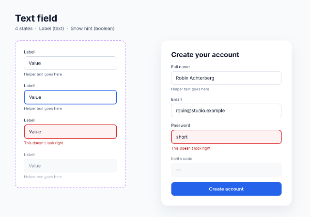
Text Field States
A text-field component set with Default, Focused, Error and Disabled variants, a text property for its label and a boolean for its hint, used in a sign-up form.
Design Tokens, Light and Dark
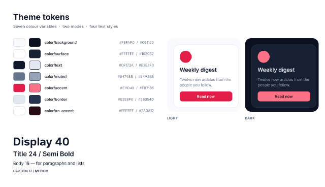
A design-system tokens page — colour variables with Light and Dark modes bound to swatches and to one card shown in both modes, plus a type scale of text styles.
Dark Mode Settings Screen
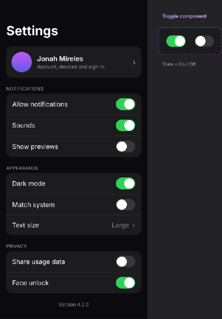
A dark-theme mobile settings screen of grouped lists, built from a Toggle component with On and Off variants and a reusable list-row layout.
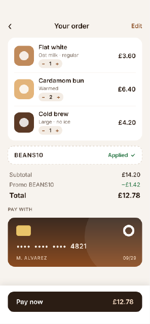
Coffee Shop Checkout
A mobile checkout — cart lines with steppers, a promo field, a totals block with space-between rows, a saved card drawn with boolean shapes and a sticky pay bar.