Plant Care App Login
A mobile sign-in screen built entirely with nested auto layout — fill-width inputs, a hugging button row and a centred footer link.
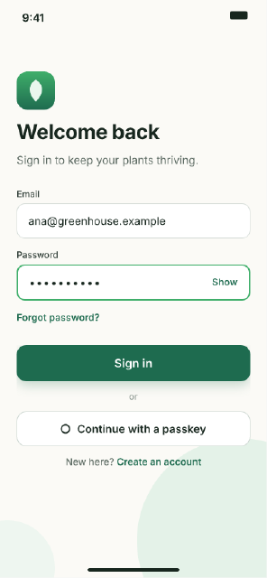
The screen is the document's first frame; inside it a "Content" frame with vertical auto layout (104 px top padding, 32 px gap) stacks the brand block, the form and the actions, each an auto layout frame of its own. Inputs and buttons fill the width and hug their text; the password field's two texts sit apart with space-between. The primary button has a tinted drop shadow, the footer link is one text layer with a styled range, and the status bar and glows sit outside the flow as ordinary children of the screen.
Steps
37 commandssteps:
- { command: select.all, params: {}, as: initial }
- { command: node.set, params: { ids: [$initial.selection.0], props: { name: Login, fill: "#FBFAF6", clip: true } } }
- { command: node.create, params: { type: ellipse, parent: $initial.selection.0, name: Glow, x: 200, y: 640, width: 300, height: 300, props: { fill: "#E4F2E8" } }, as: glow }
- { command: node.create, params: { type: ellipse, parent: $initial.selection.0, name: Glow Small, x: -60, y: 760, width: 140, height: 140, props: { fill: "#EEF6F0" } }, as: glow2 }
- { command: node.create, params: { type: frame, parent: $initial.selection.0, name: Content, x: 0, y: 0, width: 390, props: { fill: none, layout: vertical, padding: [104, 24, 36, 24], gap: 32, sizingV: hug } }, as: content }
# Brand.
- { command: node.create, params: { type: frame, parent: $content.id, name: Brand, props: { layout: vertical, gap: 14, fill: none, sizingH: fill, sizingV: hug } }, as: brand }
- { command: node.create, params: { type: frame, parent: $brand.id, name: Logo, width: 56, height: 56, props: { cornerRadius: 16, fills: [{ type: linearGradient, stops: ["#3FAE6A", "#1E6B4F"] }] } }, as: logo }
- { command: node.create, params: { type: vector, parent: $logo.id, name: Leaf, x: 14, y: 12, path: "M14 0 C24 6 28 18 14 32 C0 18 4 6 14 0 Z", props: { fill: "#E9F7EE" } } }
- { command: text.create, params: { text: Welcome back, x: 0, y: 0, parent: $brand.id, props: { fontFamily: Inter, fontStyle: Bold, fontSize: 30, letterSpacing: "-2%", fills: ["#17261E"] } } }
- { command: text.create, params: { text: Sign in to keep your plants thriving., x: 0, y: 0, parent: $brand.id, props: { fontFamily: Inter, fontStyle: Regular, fontSize: 16, fills: ["#5D6B63"] } } }
# Form.
- { command: node.create, params: { type: frame, parent: $content.id, name: Form, props: { layout: vertical, gap: 16, fill: none, sizingH: fill, sizingV: hug } }, as: form }
- { command: node.create, params: { type: frame, parent: $form.id, name: Email, props: { layout: vertical, gap: 6, fill: none, sizingH: fill, sizingV: hug } }, as: email }
- { command: text.create, params: { text: Email, x: 0, y: 0, parent: $email.id, props: { fontFamily: Inter, fontStyle: Medium, fontSize: 13, fills: ["#33413A"] } } }
- { command: node.create, params: { type: frame, parent: $email.id, name: Input, props: { layout: horizontal, padding: [15, 16, 15, 16], fill: "#FFFFFF", stroke: "#D5DCD7", strokeWeight: 1, cornerRadius: 12, sizingH: fill, sizingV: hug } }, as: emailInput }
- { command: text.create, params: { text: ana@greenhouse.example, x: 0, y: 0, parent: $emailInput.id, props: { fontFamily: Inter, fontStyle: Regular, fontSize: 16, fills: ["#17261E"] } } }
- { command: node.create, params: { type: frame, parent: $form.id, name: Password, props: { layout: vertical, gap: 6, fill: none, sizingH: fill, sizingV: hug } }, as: password }
- { command: text.create, params: { text: Password, x: 0, y: 0, parent: $password.id, props: { fontFamily: Inter, fontStyle: Medium, fontSize: 13, fills: ["#33413A"] } } }
- { command: node.create, params: { type: frame, parent: $password.id, name: Input, props: { layout: horizontal, padding: [15, 16, 15, 16], mainAlign: spaceBetween, fill: "#FFFFFF", stroke: "#3FAE6A", strokeWeight: 2, cornerRadius: 12, sizingH: fill, sizingV: hug } }, as: passInput }
- { command: text.create, params: { text: "••••••••••", x: 0, y: 0, parent: $passInput.id, props: { fontFamily: Inter, fontStyle: Regular, fontSize: 16, letterSpacing: "10%", fills: ["#17261E"] } } }
- { command: text.create, params: { text: Show, x: 0, y: 0, parent: $passInput.id, props: { fontFamily: Inter, fontStyle: Semi Bold, fontSize: 14, fills: ["#1E6B4F"] } } }
- { command: text.create, params: { text: Forgot password?, x: 0, y: 0, parent: $form.id, props: { fontFamily: Inter, fontStyle: Semi Bold, fontSize: 14, fills: ["#1E6B4F"] } }, as: forgot }
# Actions.
- { command: node.create, params: { type: frame, parent: $content.id, name: Actions, props: { layout: vertical, gap: 14, fill: none, sizingH: fill, sizingV: hug, crossAlign: center } }, as: actions }
- { command: node.create, params: { type: frame, parent: $actions.id, name: Primary Button, props: { layout: horizontal, padding: [16, 24, 16, 24], mainAlign: center, fill: "#1E6B4F", cornerRadius: 14, sizingH: fill, sizingV: hug, effects: [{ type: dropShadow, color: "#1E6B4F40", offset: [0, 6], radius: 16 }] } }, as: primary }
- { command: text.create, params: { text: Sign in, x: 0, y: 0, parent: $primary.id, props: { fontFamily: Inter, fontStyle: Semi Bold, fontSize: 17, fills: ["#FFFFFF"] } } }
- { command: text.create, params: { text: or, x: 0, y: 0, parent: $actions.id, props: { fontFamily: Inter, fontStyle: Regular, fontSize: 13, fills: ["#8A968F"] } } }
- { command: node.create, params: { type: frame, parent: $actions.id, name: Secondary Button, props: { layout: horizontal, gap: 10, padding: [15, 24, 15, 24], mainAlign: center, crossAlign: center, fill: "#FFFFFF", stroke: "#C9D3CD", strokeWeight: 1, cornerRadius: 14, sizingH: fill, sizingV: hug } }, as: secondary }
- { command: node.create, params: { type: ellipse, parent: $secondary.id, name: Key, width: 14, height: 14, props: { fill: none, stroke: "#17261E", strokeWeight: 2 } } }
- { command: text.create, params: { text: Continue with a passkey, x: 0, y: 0, parent: $secondary.id, props: { fontFamily: Inter, fontStyle: Semi Bold, fontSize: 16, fills: ["#17261E"] } } }
- { command: text.create, params: { text: New here? Create an account, x: 0, y: 0, parent: $actions.id, props: { fontFamily: Inter, fontStyle: Medium, fontSize: 14, fills: ["#5D6B63"] } }, as: footer }
- { command: text.style, params: { id: $footer.id, start: 10, end: 27, fontStyle: Semi Bold, textFills: ["#1E6B4F"] } }
# System chrome.
- { command: node.create, params: { type: frame, parent: $initial.selection.0, name: Status Bar, x: 0, y: 0, width: 390, height: 48, props: { fill: none, layout: horizontal, padding: [16, 28, 0, 32], mainAlign: spaceBetween, sizingV: fixed } }, as: status }
- { command: text.create, params: { text: "9:41", x: 0, y: 0, parent: $status.id, props: { fontFamily: Inter, fontStyle: Semi Bold, fontSize: 16, fills: ["#17261E"] } } }
- { command: node.create, params: { type: rectangle, parent: $status.id, name: Battery, width: 26, height: 12, props: { cornerRadius: 3, fill: "#17261E" } } }
- { command: node.create, params: { type: rectangle, parent: $initial.selection.0, name: Home Indicator, x: 128, y: 830, width: 134, height: 5, props: { cornerRadius: 3, fill: "#17261E" } } }
- { command: node.get, params: { id: $initial.selection.0 }, as: screen }
- { command: node.get, params: { id: $primary.id }, as: button }
- { command: text.missingFonts, params: {}, as: missing }Checks
10 checks on every buildinspect.pages= {"count":1}inspect.layers= 32inspect.contentBounds= {"width":390,"height":844}results.screen= {"name":"Login","type":"FRAME","children":{"count":5}}results.screen.children.2= {"name":"Content","layout":{"mode":"vertical","gap":32},"sizing":{"vertical":"hug"}}results.screen.children.2.childCount= 3results.button= {"name":"Primary Button","sizing":{"horizontal":"fill","vertical":"hug"},"layout":{"mode":"horizontal","mainAlign":"center"},"effects":{"count":1}}results.missing.families= {"count":0}- Diagnostics: none, the kit's own check finds nothing wrong
- The saved document opens again, and its thumbnail matches
thumb.pngwithin the render tolerance
Related
More Design samples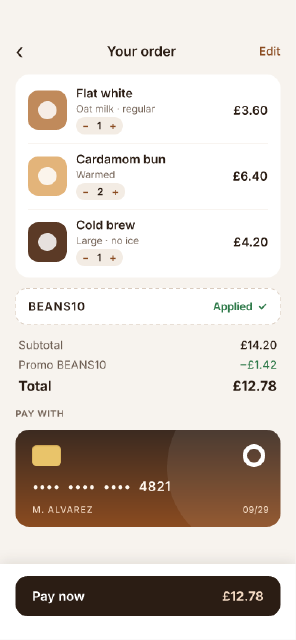
Coffee Shop Checkout
A mobile checkout — cart lines with steppers, a promo field, a totals block with space-between rows, a saved card drawn with boolean shapes and a sticky pay bar.
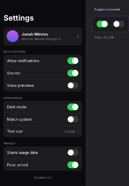
Dark Mode Settings Screen
A dark-theme mobile settings screen of grouped lists, built from a Toggle component with On and Off variants and a reusable list-row layout.
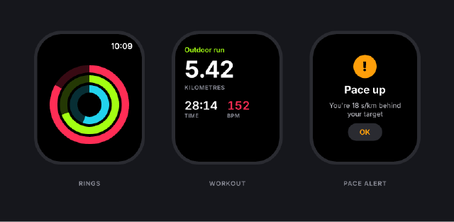
Running Watch App
Three smartwatch screens for a running app — activity rings from arc ellipses, a live workout readout and a pace alert — on a dark presentation board.
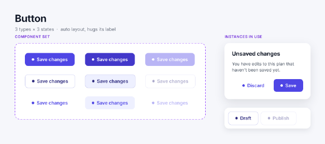
Button Component Set
A button component set with nine variants — Primary, Secondary and Ghost across Default, Hover and Disabled — and instances switched by property.