Travel Magazine Grid
A magazine front page built on a twelve-column CSS grid, with a lead story spanning two rows, gradient artwork panels, a sidebar of short reads and a footer band.
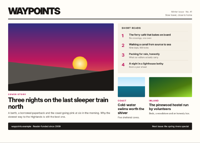
`grid-template-areas` names the lead, the two secondary stories and the sidebar; the lead spans two rows. The "photographs" are layered CSS gradients (a dusk sky with a sun and two hill lines), so the page stays self-contained. Kickers, numbered sidebar items and a masthead rule finish the editorial look.
Steps
1 commandsteps:
- command: html.setSource
as: page
params:
source: |
<!doctype html>
<html lang="en">
<head>
<meta charset="utf-8">
<title>Waypoints, Winter Issue</title>
<style>
* { box-sizing: border-box; }
body { margin: 0; padding: 32px 48px; font-family: Inter, sans-serif; background: #fffdf8; color: #1c1917; }
.masthead { display: flex; justify-content: space-between; align-items: flex-end; border-bottom: 4px solid #1c1917; padding-bottom: 12px; }
.masthead h1 { margin: 0; font-size: 56px; letter-spacing: -3px; font-weight: 900; }
.masthead div { text-align: right; font-size: 13px; color: #78716c; line-height: 1.5; }
.grid { display: grid; grid-template-columns: repeat(12, 1fr); grid-template-rows: 300px 250px; gap: 24px; margin-top: 24px;
grid-template-areas: "lead lead lead lead lead lead lead side side side side side" "lead lead lead lead lead lead lead b b c c c"; }
.lead { grid-area: lead; display: flex; flex-direction: column; }
.side { grid-area: side; }
.b { grid-area: b; }
.c { grid-area: c; }
.art { border-radius: 4px; flex: 1; }
.dusk { background: linear-gradient(172deg, transparent 74%, #1c1917 74.3%), linear-gradient(186deg, transparent 63%, #57534e 63.3%), radial-gradient(circle at 68% 60%, #fef3c7 0, #fbbf24 9%, transparent 9.5%), linear-gradient(180deg, #312e81 0%, #be185d 55%, #fb923c 100%); }
.sea { background: linear-gradient(180deg, #bae6fd 0%, #e0f2fe 45%, #0e7490 46%, #155e75 100%); height: 120px; border-radius: 4px; }
.forest { background: linear-gradient(160deg, #14532d, #4d7c0f 60%, #a3e635); height: 120px; border-radius: 4px; }
.kicker { font-size: 12px; font-weight: 800; letter-spacing: 2px; text-transform: uppercase; color: #be185d; margin: 14px 0 6px; }
.lead h2 { font-size: 38px; line-height: 1.05; letter-spacing: -1px; margin: 0 0 8px; }
.lead p { margin: 0; font-size: 15px; line-height: 1.5; color: #57534e; }
h3 { font-size: 20px; line-height: 1.2; margin: 0 0 6px; }
.b p, .c p { font-size: 13px; color: #57534e; margin: 0; line-height: 1.45; }
.side { background: #f5f0e6; padding: 20px 24px; border-radius: 4px; }
.side h4 { margin: 0 0 12px; font-size: 13px; letter-spacing: 2px; text-transform: uppercase; }
.item { display: flex; gap: 14px; padding: 10px 0; border-top: 1px solid #e7dfd0; }
.item b { font-size: 26px; color: #be185d; width: 30px; }
.item span { font-size: 15px; font-weight: 600; line-height: 1.3; }
.item small { display: block; font-weight: 400; color: #78716c; font-size: 12px; margin-top: 2px; }
footer { margin-top: 24px; background: #1c1917; color: #fafaf9; padding: 14px 20px; display: flex; justify-content: space-between; font-size: 13px; border-radius: 4px; }
</style>
</head>
<body>
<div class="masthead"><h1>WAYPOINTS</h1><div>Winter issue · No. 41<br>Slow travel, close to home</div></div>
<div class="grid">
<article class="lead">
<div class="art dusk"></div>
<div class="kicker">Cover story</div>
<h2>Three nights on the last sleeper train north</h2>
<p>A berth, a borrowed paperback and the coast going pink at six in the morning. Why the slowest way to the Highlands is still the best one.</p>
</article>
<aside class="side">
<h4>Short reads</h4>
<div class="item"><b>1</b><span>The ferry café that bakes on board<small>Six crossings, one oven</small></span></div>
<div class="item"><b>2</b><span>Walking a canal from source to sea<small>Nine days, 140 locks</small></span></div>
<div class="item"><b>3</b><span>Packing for rain, honestly<small>What our editors actually carry</small></span></div>
<div class="item"><b>4</b><span>A night in a lighthouse bothy<small>Book a year ahead</small></span></div>
</aside>
<article class="b"><div class="sea"></div><div class="kicker">Coast</div><h3>Cold-water swims worth the shiver</h3><p>Five sheltered coves.</p></article>
<article class="c"><div class="forest"></div><div class="kicker">Inland</div><h3>The pinewood hostel run by volunteers</h3><p>Beds, a woodstove and an honesty box.</p></article>
</div>
<footer><span>waypoints.example · Reader-funded since 2009</span><span>Next issue: the spring rivers special</span></footer>
</body>
</html>Checks
6 checks on every buildinspect.width= 1200inspect.height= 860inspect.source= {"contains":"grid-template-areas"}results.page.changed= true- Diagnostics: none, the kit's own check finds nothing wrong
- The saved document opens again, and its thumbnail matches
thumb.pngwithin the render tolerance
Related
More HTML samples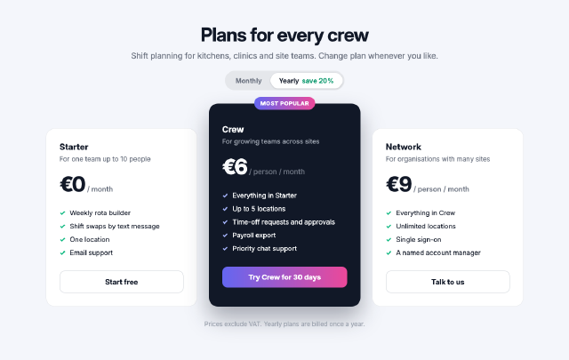
Team Plan Pricing Cards
Three pricing tiers laid out with flexbox, the middle plan raised and highlighted, each with a feature list, a price and a full-width button.
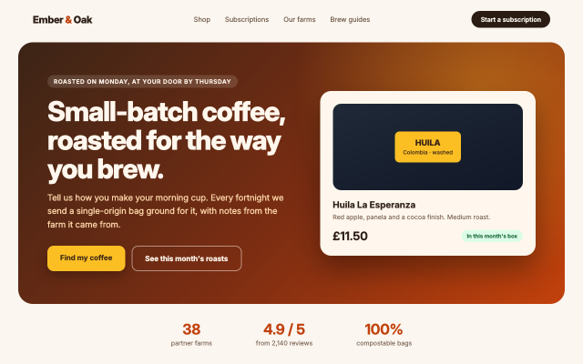
Coffee Roaster Landing Hero
The first screen of a coffee subscription site, with a navigation bar, a gradient hero, two call-to-action buttons, a product card and a row of trust figures.
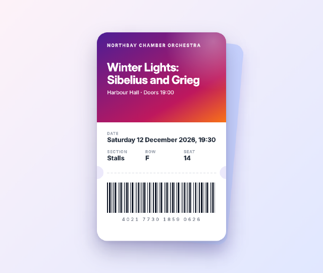
Concert Ticket Card
A mobile e-ticket for an orchestra concert, with a gradient header, punched notches, a dashed tear line, seat details in a grid and a barcode drawn with a repeating gradient.
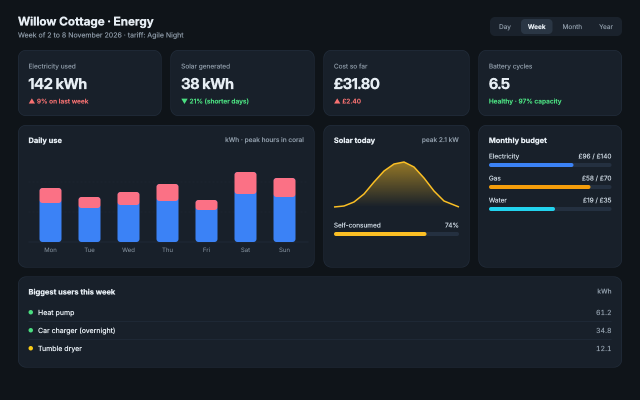
Home Energy Dashboard
A household energy dashboard with KPI cards, an inline SVG bar chart of daily use, a solar sparkline, progress bars and a device list, laid out with CSS grid.