Team Plan Pricing Cards
Three pricing tiers laid out with flexbox, the middle plan raised and highlighted, each with a feature list, a price and a full-width button.
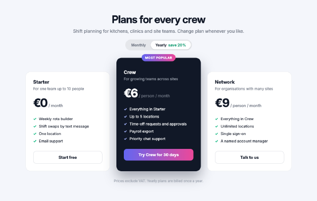
A row of three equal-width flex items aligned to the bottom so the highlighted plan stands taller, a monthly/yearly switch drawn as a segmented control, check-mark lists made with `::before`, and a ribbon badge positioned on the featured card.
Steps
1 commandsteps:
- command: html.setSource
as: page
params:
source: |
<!doctype html>
<html lang="en">
<head>
<meta charset="utf-8">
<title>Plans for every crew</title>
<style>
* { box-sizing: border-box; }
body { margin: 0; font-family: Inter, sans-serif; background: #f4f6fb; color: #111827; }
header { text-align: center; padding: 48px 0 28px; }
header h1 { margin: 0; font-size: 40px; letter-spacing: -1px; }
header p { margin: 10px 0 22px; color: #6b7280; font-size: 17px; }
.switch { display: inline-flex; background: #e5e7eb; border-radius: 999px; padding: 4px; font-size: 14px; font-weight: 600; }
.switch span { padding: 8px 18px; border-radius: 999px; color: #6b7280; }
.switch .on { background: #ffffff; color: #111827; box-shadow: 0 1px 3px rgba(0,0,0,0.15); }
.switch em { font-style: normal; color: #059669; margin-left: 6px; }
.plans { display: flex; gap: 24px; align-items: flex-end; justify-content: center; padding: 0 80px; }
.plan { flex: 1; max-width: 320px; background: #ffffff; border-radius: 20px; padding: 28px; border: 1px solid #e5e7eb; position: relative; }
.plan.featured { background: #111827; color: #f9fafb; border: none; padding-top: 44px; padding-bottom: 40px; box-shadow: 0 24px 48px rgba(17,24,39,0.35); }
.badge { position: absolute; top: -14px; left: 50%; margin-left: -64px; width: 128px; text-align: center; background: linear-gradient(90deg, #6366f1, #ec4899); color: #ffffff; font-size: 12px; font-weight: 700; padding: 6px 0; border-radius: 999px; letter-spacing: 0.5px; }
.plan h2 { margin: 0; font-size: 18px; }
.plan .for { margin: 6px 0 18px; font-size: 14px; color: #6b7280; }
.featured .for { color: #9ca3af; }
.price { font-size: 44px; font-weight: 800; letter-spacing: -1.5px; }
.price small { font-size: 15px; font-weight: 500; color: #6b7280; letter-spacing: 0; }
ul { list-style: none; padding: 0; margin: 20px 0 24px; font-size: 14px; line-height: 2; }
li::before { content: "✓"; display: inline-block; width: 22px; color: #10b981; font-weight: 800; }
.featured li::before { color: #a5b4fc; }
.btn { display: block; text-align: center; padding: 13px 0; border-radius: 12px; font-weight: 700; font-size: 15px; border: 1px solid #d1d5db; }
.featured .btn { background: linear-gradient(90deg, #6366f1, #ec4899); border: none; color: #ffffff; }
footer { text-align: center; color: #9ca3af; font-size: 13px; padding-top: 28px; }
</style>
</head>
<body>
<header>
<h1>Plans for every crew</h1>
<p>Shift planning for kitchens, clinics and site teams. Change plan whenever you like.</p>
<div class="switch"><span>Monthly</span><span class="on">Yearly<em>save 20%</em></span></div>
</header>
<section class="plans">
<div class="plan">
<h2>Starter</h2>
<p class="for">For one team up to 10 people</p>
<div class="price">€0<small> / month</small></div>
<ul><li>Weekly rota builder</li><li>Shift swaps by text message</li><li>One location</li><li>Email support</li></ul>
<span class="btn">Start free</span>
</div>
<div class="plan featured">
<span class="badge">MOST POPULAR</span>
<h2>Crew</h2>
<p class="for">For growing teams across sites</p>
<div class="price">€6<small> / person / month</small></div>
<ul><li>Everything in Starter</li><li>Up to 5 locations</li><li>Time-off requests and approvals</li><li>Payroll export</li><li>Priority chat support</li></ul>
<span class="btn">Try Crew for 30 days</span>
</div>
<div class="plan">
<h2>Network</h2>
<p class="for">For organisations with many sites</p>
<div class="price">€9<small> / person / month</small></div>
<ul><li>Everything in Crew</li><li>Unlimited locations</li><li>Single sign-on</li><li>A named account manager</li></ul>
<span class="btn">Talk to us</span>
</div>
</section>
<footer>Prices exclude VAT. Yearly plans are billed once a year.</footer>
</body>
</html>Checks
6 checks on every buildinspect.width= 1200inspect.height= 760inspect.source= {"contains":"MOST POPULAR"}results.page.changed= true- Diagnostics: none, the kit's own check finds nothing wrong
- The saved document opens again, and its thumbnail matches
thumb.pngwithin the render tolerance
Related
More HTML samples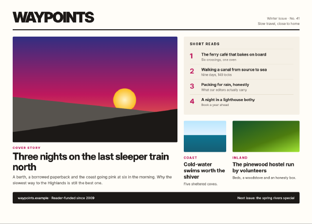
Travel Magazine Grid
A magazine front page built on a twelve-column CSS grid, with a lead story spanning two rows, gradient artwork panels, a sidebar of short reads and a footer band.
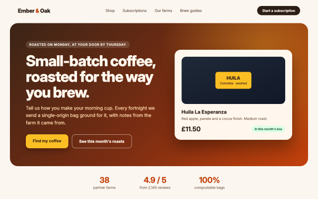
Coffee Roaster Landing Hero
The first screen of a coffee subscription site, with a navigation bar, a gradient hero, two call-to-action buttons, a product card and a row of trust figures.
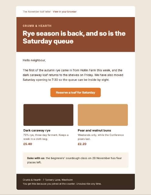
Bakery Newsletter Email
A 600-pixel email newsletter built the way mail clients need it, with nested tables, inline styles, a bulletproof button and a two-column product row.
Bistro Dinner Menu
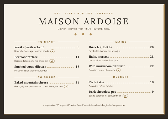
A printed-style dinner menu with a centred masthead, dotted leaders between dishes and prices, small descriptions, dietary tags and a two-column course layout.