Coffee Roaster Landing Hero
The first screen of a coffee subscription site, with a navigation bar, a gradient hero, two call-to-action buttons, a product card and a row of trust figures.
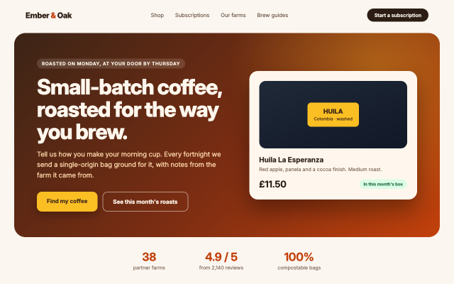
One self-contained page (inline CSS, no images or external files) drawn by Kition's own HTML renderer: a flex navigation bar, a two-column hero over a linear and a radial gradient, rounded buttons with shadows, a product card whose "bag" is drawn with CSS alone, and a three-figure strip. Text is set in the renderer's bundled Inter.
Steps
1 commandsteps:
- command: html.setSource
as: page
params:
source: |
<!doctype html>
<html lang="en">
<head>
<meta charset="utf-8">
<title>Ember & Oak Coffee Roasters</title>
<style>
* { box-sizing: border-box; }
body { margin: 0; font-family: Inter, system-ui, sans-serif; color: #2b1d14; background: #fbf6f0; }
nav { display: flex; align-items: center; justify-content: space-between; padding: 24px 72px; }
.logo { font-weight: 800; font-size: 22px; letter-spacing: -0.5px; }
.logo span { color: #c2410c; }
.links { display: flex; gap: 32px; font-size: 15px; color: #6b5444; }
.nav-cta { padding: 10px 20px; border-radius: 999px; background: #2b1d14; color: #fbf6f0; font-size: 14px; font-weight: 600; }
.hero { margin: 8px 40px 0; padding: 72px 64px; border-radius: 32px; display: flex; gap: 56px; align-items: center;
background: radial-gradient(circle at 85% 20%, rgba(251,191,36,0.35), transparent 40%), linear-gradient(135deg, #3b2416 0%, #7c2d12 55%, #c2410c 100%); color: #fff7ed; }
.copy { flex: 1.3; }
.eyebrow { display: inline-block; padding: 6px 14px; border-radius: 999px; background: rgba(255,247,237,0.14); font-size: 13px; font-weight: 600; letter-spacing: 1px; text-transform: uppercase; }
h1 { font-size: 60px; line-height: 1.05; letter-spacing: -2px; margin: 20px 0 18px; font-weight: 800; }
.lede { font-size: 19px; line-height: 1.55; color: #fed7aa; max-width: 520px; margin: 0 0 32px; }
.buttons { display: flex; gap: 14px; }
.btn { padding: 16px 28px; border-radius: 14px; font-weight: 700; font-size: 16px; }
.primary { background: #fbbf24; color: #3b2416; box-shadow: 0 10px 24px rgba(0,0,0,0.25); }
.ghost { border: 2px solid rgba(255,247,237,0.5); color: #fff7ed; }
.card { flex: 1; background: #fff7ed; color: #2b1d14; border-radius: 24px; padding: 28px; box-shadow: 0 30px 60px rgba(0,0,0,0.35); }
.bag { height: 190px; border-radius: 18px; background: linear-gradient(160deg, #1f2937, #111827); position: relative; display: flex; align-items: center; justify-content: center; }
.bag .label { background: #fbbf24; color: #3b2416; padding: 14px 18px; border-radius: 10px; text-align: center; font-weight: 800; font-size: 18px; line-height: 1.2; }
.bag .label small { display: block; font-weight: 500; font-size: 12px; margin-top: 4px; }
.card h3 { margin: 20px 0 6px; font-size: 20px; }
.card p { margin: 0; color: #7c6555; font-size: 14px; }
.price { display: flex; justify-content: space-between; align-items: center; margin-top: 18px; }
.price strong { font-size: 26px; }
.pill { background: #dcfce7; color: #166534; padding: 6px 12px; border-radius: 999px; font-size: 12px; font-weight: 700; }
.stats { display: flex; justify-content: center; gap: 96px; padding: 36px 0; }
.stat { text-align: center; }
.stat b { display: block; font-size: 32px; color: #c2410c; }
.stat span { font-size: 14px; color: #7c6555; }
</style>
</head>
<body>
<nav>
<div class="logo">Ember <span>&</span> Oak</div>
<div class="links"><span>Shop</span><span>Subscriptions</span><span>Our farms</span><span>Brew guides</span></div>
<div class="nav-cta">Start a subscription</div>
</nav>
<section class="hero">
<div class="copy">
<span class="eyebrow">Roasted on Monday, at your door by Thursday</span>
<h1>Small-batch coffee, roasted for the way you brew.</h1>
<p class="lede">Tell us how you make your morning cup. Every fortnight we send a single-origin bag ground for it, with notes from the farm it came from.</p>
<div class="buttons"><span class="btn primary">Find my coffee</span><span class="btn ghost">See this month's roasts</span></div>
</div>
<div class="card">
<div class="bag"><div class="label">HUILA<small>Colombia · washed</small></div></div>
<h3>Huila La Esperanza</h3>
<p>Red apple, panela and a cocoa finish. Medium roast.</p>
<div class="price"><strong>£11.50</strong><span class="pill">In this month's box</span></div>
</div>
</section>
<section class="stats">
<div class="stat"><b>38</b><span>partner farms</span></div>
<div class="stat"><b>4.9 / 5</b><span>from 2,140 reviews</span></div>
<div class="stat"><b>100%</b><span>compostable bags</span></div>
</section>
</body>
</html>Checks
6 checks on every buildinspect.width= 1280inspect.height= 800inspect.source= {"contains":"Small-batch coffee, roasted for the way you brew."}results.page.changed= true- Diagnostics: none, the kit's own check finds nothing wrong
- The saved document opens again, and its thumbnail matches
thumb.pngwithin the render tolerance
Related
More HTML samples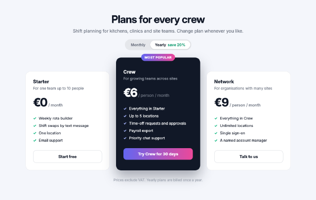
Team Plan Pricing Cards
Three pricing tiers laid out with flexbox, the middle plan raised and highlighted, each with a feature list, a price and a full-width button.
Concert Ticket Card
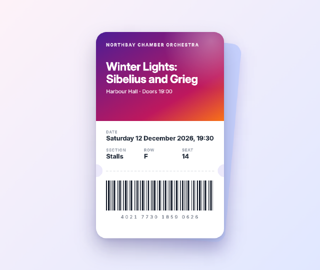
A mobile e-ticket for an orchestra concert, with a gradient header, punched notches, a dashed tear line, seat details in a grid and a barcode drawn with a repeating gradient.
Travel Magazine Grid
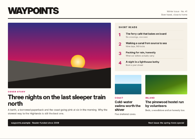
A magazine front page built on a twelve-column CSS grid, with a lead story spanning two rows, gradient artwork panels, a sidebar of short reads and a footer band.
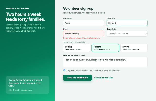
Volunteer Signup Form
A two-column signup page with real form controls, a field in its error state, radio cards, a consent check box and a primary button beside an illustrated panel.