Mobile App Login Screen
A sign-in screen for a fictional budgeting app at 375 × 812 pt (@2x), with fields, a gradient button and grouped sections.
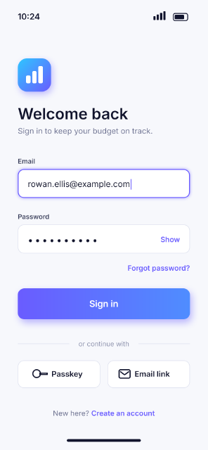
A phone-sized mockup laid out on a 2× grid: status bar, app mark, heading, two input fields (one focused, with an accent stroke and a soft glow), a gradient primary button with a coloured shadow, alternative sign-in buttons and a footer link. Each part of the screen is its own named layer group, the way a designer hands a screen to a developer: the status bar and the form are grouped from selected layers, the other sections are made as groups and filled in place.
Steps
60 commandssteps:
- { command: layer.newFillLayer.solidColor, params: { color: "#f7f8fc" }, as: screen }
- { command: layer.setProps, params: { layer: $screen.layer, name: Screen } }
- { command: type.create, params: { x: 64, y: 70, text: "10:24", font: Inter, size: 30, weight: 600, color: "#11142d", name: Clock }, as: clock }
- { command: shape.create, params: { kind: roundedRect, rect: [626, 48, 52, 26], radii: 7, fill: null, stroke: { width: 3, color: "#11142d" }, name: Battery }, as: battery }
- { command: shape.create, params: { kind: roundedRect, rect: [631, 53, 34, 16], radii: 3, fill: "#11142d", name: Battery Level }, as: level }
- { command: shape.create, params: { kind: roundedRect, rect: [566, 52, 8, 20], radii: 2, fill: "#11142d", name: Signal }, as: signal }
- { command: shape.create, params: { kind: roundedRect, rect: [554, 58, 8, 14], radii: 2, fill: "#11142d", addTo: $signal.layer, op: combine } }
- { command: shape.create, params: { kind: roundedRect, rect: [578, 46, 8, 26], radii: 2, fill: "#11142d", addTo: $signal.layer, op: combine } }
- { command: shape.create, params: { kind: roundedRect, rect: [590, 40, 8, 32], radii: 2, fill: "#11142d", addTo: $signal.layer, op: combine } }
- { command: layer.select, params: { layer: $clock.layer } }
- { command: layer.select, params: { layer: $battery.layer, mode: add } }
- { command: layer.select, params: { layer: $level.layer, mode: add } }
- { command: layer.select, params: { layer: $signal.layer, mode: add } }
- { command: layer.groupLayers, params: { name: Status Bar }, as: statusBar }
- { command: layer.new.group, params: { name: Header }, as: header }
- { command: layer.moveTo, params: { layer: $header.layer, target: $statusBar.layer, position: above } }
- { command: shape.create, params: { kind: roundedRect, rect: [64, 210, 120, 120], radii: 34, fill: { gradient: { stops: [[0, "#6a5cff"], [1, "#2ec5ff"]], angle: 135 } }, name: App Mark }, as: mark }
- { command: layer.layerStyle.dropShadow, params: { layer: $mark.layer, color: "#5b4dff", opacity: 35, distance: 12, size: 28, angle: 90 } }
- { command: shape.create, params: { kind: roundedRect, rect: [94, 272, 16, 28], radii: 5, fill: "#ffffff", name: Mark Glyph }, as: glyph }
- { command: shape.create, params: { kind: roundedRect, rect: [116, 256, 16, 44], radii: 5, fill: "#ffffff", addTo: $glyph.layer, op: combine } }
- { command: shape.create, params: { kind: roundedRect, rect: [138, 238, 16, 62], radii: 5, fill: "#ffffff", addTo: $glyph.layer, op: combine } }
- { command: type.create, params: { x: 64, y: 430, text: Welcome back, font: Inter, size: 56, weight: 600, color: "#11142d", name: Heading }, as: heading }
- { command: type.create, params: { x: 64, y: 482, text: Sign in to keep your budget on track., font: Inter, size: 28, color: "#6b7090", name: Subheading }, as: sub }
- { command: type.create, params: { x: 64, y: 590, text: Email, font: Inter, size: 24, weight: 600, color: "#3a3f5c", name: Email Label }, as: emailLabel }
- { command: layer.moveTo, params: { layer: $emailLabel.layer, target: $header.layer, position: above } }
- { command: shape.create, params: { kind: roundedRect, rect: [64, 610, 622, 104], radii: 22, fill: "#ffffff", stroke: { width: 3, color: "#6a5cff", align: inside }, name: Email Field }, as: emailField }
- { command: layer.layerStyle.outerGlow, params: { layer: $emailField.layer, color: "#6a5cff", opacity: 30, size: 14, blend: normal } }
- { command: type.create, params: { x: 100, y: 674, text: "rowan.ellis@example.com", font: Inter, size: 30, color: "#11142d", name: Email Value }, as: emailValue }
- { command: shape.create, params: { kind: rect, rect: [472, 646, 3, 38], fill: "#6a5cff", name: Caret }, as: caret }
- { command: type.create, params: { x: 64, y: 790, text: Password, font: Inter, size: 24, weight: 600, color: "#3a3f5c", name: Password Label }, as: pwLabel }
- { command: shape.create, params: { kind: roundedRect, rect: [64, 810, 622, 104], radii: 22, fill: "#ffffff", stroke: { width: 2, color: "#dfe2ef", align: inside }, name: Password Field }, as: pwField }
- { command: type.create, params: { x: 100, y: 878, text: "••••••••••", font: Inter, size: 34, tracking: 200, color: "#11142d", name: Password Dots }, as: dots }
- { command: type.create, params: { x: 650, y: 873, text: Show, font: Inter, size: 26, weight: 600, color: "#6a5cff", align: right, name: Show Toggle }, as: show }
- { command: type.create, params: { x: 686, y: 976, text: Forgot password?, font: Inter, size: 26, weight: 600, color: "#6a5cff", align: right, name: Forgot Link }, as: forgot }
- { command: layer.select, params: { layer: $emailLabel.layer } }
- { command: layer.select, params: { layer: $forgot.layer, mode: range } }
- { command: layer.groupLayers, params: { name: Form }, as: form }
- { command: layer.new.group, params: { name: Sign In }, as: signIn }
- { command: layer.moveTo, params: { layer: $signIn.layer, target: $form.layer, position: above } }
- { command: shape.create, params: { kind: roundedRect, rect: [64, 1040, 622, 112], radii: 24, fill: { gradient: { stops: [[0, "#6a5cff"], [1, "#4f8dff"]], angle: 0 } }, name: Sign In Button }, as: button }
- { command: layer.layerStyle.dropShadow, params: { layer: $button.layer, color: "#5b4dff", opacity: 40, distance: 14, size: 30, angle: 90 } }
- { command: type.create, params: { x: 375, y: 1107, text: Sign in, font: Inter, size: 32, weight: 600, color: "#ffffff", align: center, name: Button Label } }
- { command: layer.new.group, params: { name: Other Sign-In Options }, as: options }
- { command: layer.moveTo, params: { layer: $options.layer, target: $signIn.layer, position: above } }
- { command: shape.create, params: { kind: line, from: [64, 1240], to: [250, 1240], weight: 2, fill: "#dfe2ef", name: Divider Left } }
- { command: shape.create, params: { kind: line, from: [500, 1240], to: [686, 1240], weight: 2, fill: "#dfe2ef", name: Divider Right } }
- { command: type.create, params: { x: 375, y: 1249, text: or continue with, font: Inter, size: 24, color: "#8a8fab", align: center, name: Divider Text } }
- { command: shape.create, params: { kind: roundedRect, rect: [64, 1300, 298, 100], radii: 22, fill: "#ffffff", stroke: { width: 2, color: "#dfe2ef", align: inside }, name: Passkey Button } }
- { command: shape.create, params: { kind: roundedRect, rect: [388, 1300, 298, 100], radii: 22, fill: "#ffffff", stroke: { width: 2, color: "#dfe2ef", align: inside }, name: Magic Link Button } }
- { command: shape.create, params: { kind: ellipse, rect: [118, 1334, 28, 28], fill: null, stroke: { width: 4, color: "#11142d" }, name: Key Icon }, as: key }
- { command: shape.create, params: { kind: rect, rect: [144, 1346, 26, 5], fill: "#11142d", addTo: $key.layer, op: combine } }
- { command: type.create, params: { x: 186, y: 1359, text: Passkey, font: Inter, size: 28, weight: 600, color: "#11142d", name: Passkey Label } }
- { command: shape.create, params: { kind: roundedRect, rect: [430, 1334, 40, 30], radii: 5, fill: null, stroke: { width: 4, color: "#11142d" }, name: Mail Icon }, as: mail }
- { command: shape.create, params: { kind: path, addTo: $mail.layer, op: combine, path: { subpaths: [ { closed: false, knots: [[434, 1340], [450, 1352], [466, 1340]] } ] } } }
- { command: type.create, params: { x: 486, y: 1359, text: Email link, font: Inter, size: 28, weight: 600, color: "#11142d", name: Magic Link Label } }
- { command: layer.new.group, params: { name: Footer Area }, as: footerArea }
- { command: layer.moveTo, params: { layer: $footerArea.layer, target: $options.layer, position: above } }
- { command: type.create, params: { x: 375, y: 1500, text: "New here? Create an account", font: Inter, size: 26, color: "#6b7090", align: center, name: Footer }, as: footer }
- { command: type.setStyle, params: { layer: $footer.layer, range: [10, 27], weight: 600, color: "#6a5cff" } }
- { command: shape.create, params: { kind: roundedRect, rect: [241, 1584, 268, 10], radii: 5, fill: "#11142d", name: Home Indicator } }Checks
13 checks on every buildinspect.width= 750inspect.height= 1624inspect.layers= {"count":8,"all":{"kind":{"oneOf":["Group","Fill","Pixel"]}}}inspect.layers.0= {"name":"Footer Area","kind":"Group","children":{"count":2}}inspect.layers.1= {"name":"Other Sign-In Options","kind":"Group","children":{"count":9}}inspect.layers.2= {"name":"Sign In","kind":"Group","children":{"count":2}}inspect.layers.4= {"name":"Header","kind":"Group","children":{"count":4}}inspect.layers.-3= {"name":"Status Bar","kind":"Group","children":{"count":4}}inspect.layers.-2= {"name":"Screen","kind":"Fill","fillContent":"#f7f8fc"}inspect.layers.3= {"name":"Form","kind":"Group","children":{"count":9,"any":{"name":"Email Field","kind":"Shape","shape":{"stroke":{"fill":"#6a5cff","align":"inside"}},"effect…inspect.layers.2.children.1= {"name":"Sign In Button","shape":{"fill":{"gradient":{"stops":[[0,"#6a5cff"],[1,"#4f8dff"]]}}},"effects":{"items":{"any":{"key":"dropShadow"}}}}- Diagnostics: none, the kit's own check finds nothing wrong
- The saved document opens again, and its thumbnail matches
thumb.pngwithin the render tolerance
Related
More Photo samples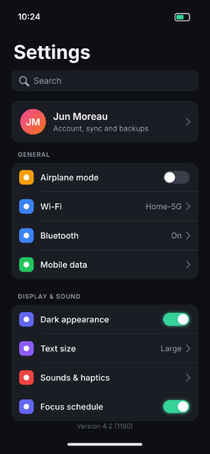
Dark Mode Settings Screen
A dark-theme phone settings screen at 375 × 812 pt (@2x), with grouped list cards, toggles, values and chevrons.
App Icon Grid
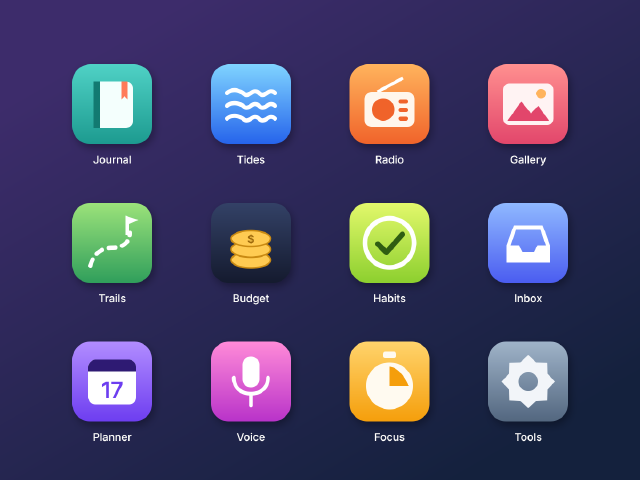
Twelve rounded-square app icons for a fictional suite, with gradient fills, soft shadows and simple vector glyphs on a home-screen grid.
Button States Component Sheet
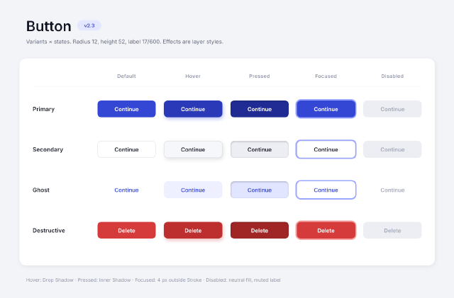
A design-system sheet of four button variants in five interaction states, with the states made from layer styles.
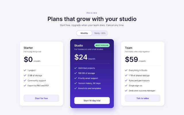
SaaS Pricing Table
A three-tier pricing section for a web page, with a highlighted middle plan, a billing toggle and checkmark feature lists.