Dark Mode Settings Screen
A dark-theme phone settings screen at 375 × 812 pt (@2x), with grouped list cards, toggles, values and chevrons.
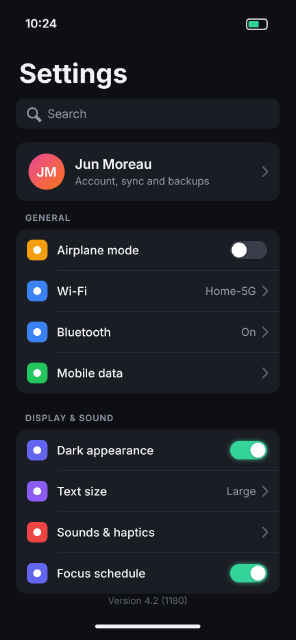
A settings screen in a dark palette: near-black page, raised grey cards, muted secondary text and one green accent kept for switched-on toggles, which also get a faint Outer Glow. The toggle knobs carry a small Drop Shadow, the chevrons are open stroked paths, and the rows are laid out on a 104 px rhythm.
Steps
71 commandssteps:
- { command: layer.newFillLayer.solidColor, params: { color: "#0e0f13" }, as: screen }
- { command: layer.setProps, params: { layer: $screen.layer, name: Screen } }
- { command: type.create, params: { x: 64, y: 70, text: "10:24", font: Inter, size: 30, weight: 600, color: "#f2f3f7", name: Clock } }
- { command: shape.create, params: { kind: roundedRect, rect: [626, 48, 52, 26], radii: 7, fill: null, stroke: { width: 3, color: "#f2f3f7" }, name: Battery } }
- { command: shape.create, params: { kind: roundedRect, rect: [631, 53, 26, 16], radii: 3, fill: "#34d399", name: Battery Level } }
- { command: type.create, params: { x: 48, y: 210, text: Settings, font: Inter, size: 68, weight: 700, color: "#f2f3f7", name: Title } }
- { command: shape.create, params: { kind: roundedRect, rect: [40, 250, 670, 76], radii: 20, fill: "#1b1d24", name: Search Field } }
- { command: shape.create, params: { kind: ellipse, rect: [70, 274, 24, 24], fill: null, stroke: { width: 4, color: "#9096a6" }, name: Search Icon }, as: si }
- { command: shape.create, params: { kind: line, from: [92, 296], to: [102, 306], weight: 4, fill: "#9096a6", addTo: $si.layer, op: combine } }
- { command: type.create, params: { x: 120, y: 299, text: Search, font: Inter, size: 30, color: "#9096a6", name: Search Placeholder } }
- { command: shape.create, params: { kind: roundedRect, rect: [40, 360, 670, 150], radii: 28, fill: "#1b1d24", name: Profile Card } }
- { command: shape.create, params: { kind: ellipse, rect: [72, 389, 92, 92], fill: { gradient: { stops: [[0, "#f97316"], [1, "#ec4899"]], angle: 135 } }, name: Avatar } }
- { command: type.create, params: { x: 118, y: 448, text: JM, font: Inter, size: 34, weight: 600, color: "#ffffff", align: center, name: Avatar Initials } }
- { command: type.create, params: { x: 190, y: 428, text: Jun Moreau, font: Inter, size: 34, weight: 600, color: "#f2f3f7", name: Profile Name } }
- { command: type.create, params: { x: 190, y: 468, text: "Account, sync and backups", font: Inter, size: 26, color: "#9096a6", name: Profile Detail } }
- { command: shape.create, params: { kind: path, fill: null, stroke: { width: 4, color: "#5c6170", cap: round, join: round }, name: "Profile Chevron", path: { subpaths: [{ closed: false, knots: [[668, 423], [679, 435], [668, 447]] }] } } }
- { command: type.create, params: { x: 64, y: 560, text: "GENERAL", font: Inter, size: 22, weight: 600, tracking: 80, color: "#9096a6", name: "Section GENERAL" } }
- { command: shape.create, params: { kind: roundedRect, rect: [40, 582, 670, 416], radii: 28, fill: "#1b1d24", name: "Card GENERAL" } }
- { command: shape.create, params: { kind: roundedRect, rect: [68, 608, 52, 52], radii: 14, fill: "#f59e0b", name: "Airplane mode Icon" } }
- { command: shape.create, params: { kind: ellipse, rect: [84, 624, 20, 20], fill: "#ffffff", name: "Airplane mode Glyph" } }
- { command: type.create, params: { x: 144, y: 645, text: "Airplane mode", font: Inter, size: 30, weight: 500, color: "#f2f3f7", name: "Airplane mode Label" } }
- { command: shape.create, params: { kind: roundedRect, rect: [584, 611, 94, 46], radii: 23, fill: "#3a3e4a", name: "Airplane mode Toggle" }, as: t1 }
- { command: shape.create, params: { kind: ellipse, rect: [588, 615, 38, 38], fill: "#ffffff", name: "Airplane mode Knob" }, as: k1 }
- { command: layer.layerStyle.dropShadow, params: { layer: $k1.layer, color: "#000000", opacity: 35, distance: 2, size: 6, angle: 90 } }
- { command: shape.create, params: { kind: line, from: [144, 686], to: [710, 686], weight: 2, fill: "#2a2d36", name: "Airplane mode Separator" } }
- { command: shape.create, params: { kind: roundedRect, rect: [68, 712, 52, 52], radii: 14, fill: "#3b82f6", name: "Wi-Fi Icon" } }
- { command: shape.create, params: { kind: ellipse, rect: [84, 728, 20, 20], fill: "#ffffff", name: "Wi-Fi Glyph" } }
- { command: type.create, params: { x: 144, y: 749, text: "Wi-Fi", font: Inter, size: 30, weight: 500, color: "#f2f3f7", name: "Wi-Fi Label" } }
- { command: type.create, params: { x: 650, y: 748, text: "Home-5G", font: Inter, size: 28, color: "#9096a6", align: right, name: "Wi-Fi Value" } }
- { command: shape.create, params: { kind: path, fill: null, stroke: { width: 4, color: "#5c6170", cap: round, join: round }, name: "Wi-Fi Chevron", path: { subpaths: [{ closed: false, knots: [[668, 726], [679, 738], [668, 750]] }] } } }
- { command: shape.create, params: { kind: line, from: [144, 790], to: [710, 790], weight: 2, fill: "#2a2d36", name: "Wi-Fi Separator" } }
- { command: shape.create, params: { kind: roundedRect, rect: [68, 816, 52, 52], radii: 14, fill: "#3b82f6", name: "Bluetooth Icon" } }
- { command: shape.create, params: { kind: ellipse, rect: [84, 832, 20, 20], fill: "#ffffff", name: "Bluetooth Glyph" } }
- { command: type.create, params: { x: 144, y: 853, text: "Bluetooth", font: Inter, size: 30, weight: 500, color: "#f2f3f7", name: "Bluetooth Label" } }
- { command: type.create, params: { x: 650, y: 852, text: "On", font: Inter, size: 28, color: "#9096a6", align: right, name: "Bluetooth Value" } }
- { command: shape.create, params: { kind: path, fill: null, stroke: { width: 4, color: "#5c6170", cap: round, join: round }, name: "Bluetooth Chevron", path: { subpaths: [{ closed: false, knots: [[668, 830], [679, 842], [668, 854]] }] } } }
- { command: shape.create, params: { kind: line, from: [144, 894], to: [710, 894], weight: 2, fill: "#2a2d36", name: "Bluetooth Separator" } }
- { command: shape.create, params: { kind: roundedRect, rect: [68, 920, 52, 52], radii: 14, fill: "#22c55e", name: "Mobile data Icon" } }
- { command: shape.create, params: { kind: ellipse, rect: [84, 936, 20, 20], fill: "#ffffff", name: "Mobile data Glyph" } }
- { command: type.create, params: { x: 144, y: 957, text: "Mobile data", font: Inter, size: 30, weight: 500, color: "#f2f3f7", name: "Mobile data Label" } }
- { command: shape.create, params: { kind: path, fill: null, stroke: { width: 4, color: "#5c6170", cap: round, join: round }, name: "Mobile data Chevron", path: { subpaths: [{ closed: false, knots: [[668, 934], [679, 946], [668, 958]] }] } } }
- { command: type.create, params: { x: 64, y: 1068, text: "DISPLAY & SOUND", font: Inter, size: 22, weight: 600, tracking: 80, color: "#9096a6", name: "Section DISPLAY & SOUND" } }
- { command: shape.create, params: { kind: roundedRect, rect: [40, 1090, 670, 416], radii: 28, fill: "#1b1d24", name: "Card DISPLAY & SOUND" } }
- { command: shape.create, params: { kind: roundedRect, rect: [68, 1116, 52, 52], radii: 14, fill: "#6366f1", name: "Dark appearance Icon" } }
- { command: shape.create, params: { kind: ellipse, rect: [84, 1132, 20, 20], fill: "#ffffff", name: "Dark appearance Glyph" } }
- { command: type.create, params: { x: 144, y: 1153, text: "Dark appearance", font: Inter, size: 30, weight: 500, color: "#f2f3f7", name: "Dark appearance Label" } }
- { command: shape.create, params: { kind: roundedRect, rect: [584, 1119, 94, 46], radii: 23, fill: "#34d399", name: "Dark appearance Toggle" }, as: t2 }
- { command: shape.create, params: { kind: ellipse, rect: [636, 1123, 38, 38], fill: "#ffffff", name: "Dark appearance Knob" }, as: k2 }
- { command: layer.layerStyle.dropShadow, params: { layer: $k2.layer, color: "#000000", opacity: 35, distance: 2, size: 6, angle: 90 } }
- { command: layer.layerStyle.outerGlow, params: { layer: $t2.layer, color: "#34d399", opacity: 35, size: 14 } }
- { command: shape.create, params: { kind: line, from: [144, 1194], to: [710, 1194], weight: 2, fill: "#2a2d36", name: "Dark appearance Separator" } }
- { command: shape.create, params: { kind: roundedRect, rect: [68, 1220, 52, 52], radii: 14, fill: "#8b5cf6", name: "Text size Icon" } }
- { command: shape.create, params: { kind: ellipse, rect: [84, 1236, 20, 20], fill: "#ffffff", name: "Text size Glyph" } }
- { command: type.create, params: { x: 144, y: 1257, text: "Text size", font: Inter, size: 30, weight: 500, color: "#f2f3f7", name: "Text size Label" } }
- { command: type.create, params: { x: 650, y: 1256, text: "Large", font: Inter, size: 28, color: "#9096a6", align: right, name: "Text size Value" } }
- { command: shape.create, params: { kind: path, fill: null, stroke: { width: 4, color: "#5c6170", cap: round, join: round }, name: "Text size Chevron", path: { subpaths: [{ closed: false, knots: [[668, 1234], [679, 1246], [668, 1258]] }] } } }
- { command: shape.create, params: { kind: line, from: [144, 1298], to: [710, 1298], weight: 2, fill: "#2a2d36", name: "Text size Separator" } }
- { command: shape.create, params: { kind: roundedRect, rect: [68, 1324, 52, 52], radii: 14, fill: "#ef4444", name: "Sounds & haptics Icon" } }
- { command: shape.create, params: { kind: ellipse, rect: [84, 1340, 20, 20], fill: "#ffffff", name: "Sounds & haptics Glyph" } }
- { command: type.create, params: { x: 144, y: 1361, text: "Sounds & haptics", font: Inter, size: 30, weight: 500, color: "#f2f3f7", name: "Sounds & haptics Label" } }
- { command: shape.create, params: { kind: path, fill: null, stroke: { width: 4, color: "#5c6170", cap: round, join: round }, name: "Sounds & haptics Chevron", path: { subpaths: [{ closed: false, knots: [[668, 1338], [679, 1350], [668, 1362]] }] } } }
- { command: shape.create, params: { kind: line, from: [144, 1402], to: [710, 1402], weight: 2, fill: "#2a2d36", name: "Sounds & haptics Separator" } }
- { command: shape.create, params: { kind: roundedRect, rect: [68, 1428, 52, 52], radii: 14, fill: "#6366f1", name: "Focus schedule Icon" } }
- { command: shape.create, params: { kind: ellipse, rect: [84, 1444, 20, 20], fill: "#ffffff", name: "Focus schedule Glyph" } }
- { command: type.create, params: { x: 144, y: 1465, text: "Focus schedule", font: Inter, size: 30, weight: 500, color: "#f2f3f7", name: "Focus schedule Label" } }
- { command: shape.create, params: { kind: roundedRect, rect: [584, 1431, 94, 46], radii: 23, fill: "#34d399", name: "Focus schedule Toggle" }, as: t3 }
- { command: shape.create, params: { kind: ellipse, rect: [636, 1435, 38, 38], fill: "#ffffff", name: "Focus schedule Knob" }, as: k3 }
- { command: layer.layerStyle.dropShadow, params: { layer: $k3.layer, color: "#000000", opacity: 35, distance: 2, size: 6, angle: 90 } }
- { command: layer.layerStyle.outerGlow, params: { layer: $t3.layer, color: "#34d399", opacity: 35, size: 14 } }
- { command: type.create, params: { x: 375, y: 1532, text: "Version 4.2 (1180)", font: Inter, size: 24, color: "#5c6170", align: center, name: Version } }
- { command: shape.create, params: { kind: roundedRect, rect: [241, 1584, 268, 10], radii: 5, fill: "#f2f3f7", name: Home Indicator } }Checks
7 checks on every buildinspect.layers= {"any":{"name":"Dark appearance Toggle","kind":"Shape","effects":{"items":[{"enabled":true,"key":"outerGlow","kind":"Outer Glow"}]}}}inspect.layers= {"any":{"name":"Airplane mode Toggle","kind":"Shape","effects":{"exists":false}}}inspect.layers= {"any":{"name":"Wi-Fi Value","kind":"Type","text":{"text":"Home-5G"}}}results.t2.fill= "#34d399"results.t1.fill= "#3a3e4a"- Diagnostics: none, the kit's own check finds nothing wrong
- The saved document opens again, and its thumbnail matches
thumb.pngwithin the render tolerance
Related
More Photo samples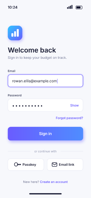
Mobile App Login Screen
A sign-in screen for a fictional budgeting app at 375 × 812 pt (@2x), with fields, a gradient button and grouped sections.
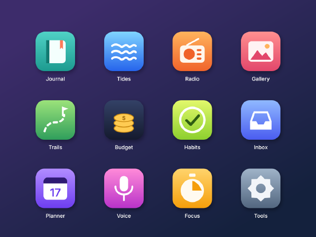
App Icon Grid
Twelve rounded-square app icons for a fictional suite, with gradient fills, soft shadows and simple vector glyphs on a home-screen grid.
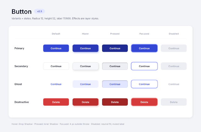
Button States Component Sheet
A design-system sheet of four button variants in five interaction states, with the states made from layer styles.
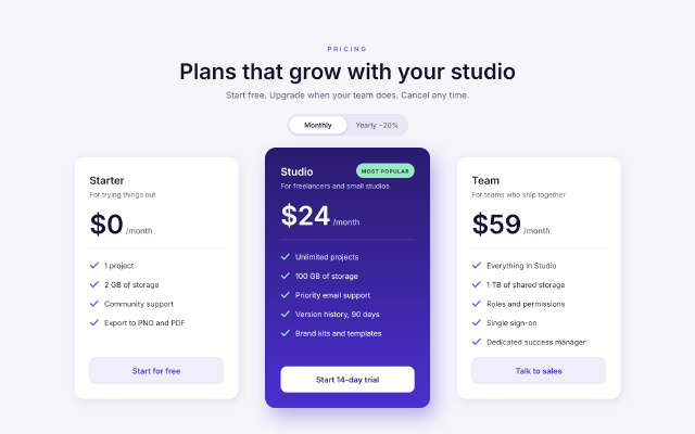
SaaS Pricing Table
A three-tier pricing section for a web page, with a highlighted middle plan, a billing toggle and checkmark feature lists.