Button States Component Sheet
A design-system sheet of four button variants in five interaction states, with the states made from layer styles.
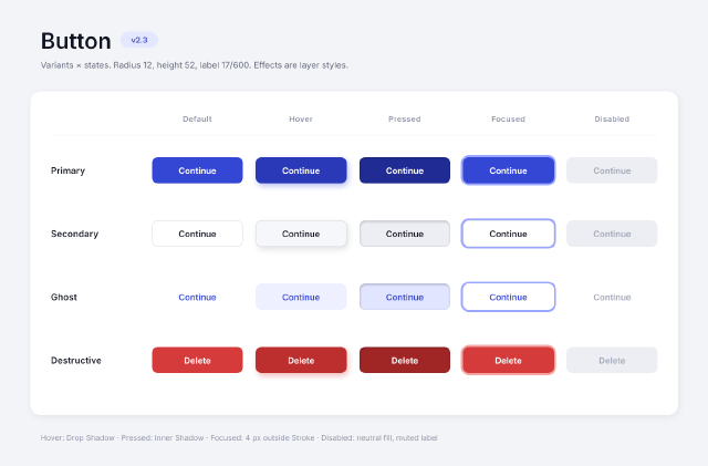
Primary, secondary, ghost and destructive buttons across default, hover, pressed, focused and disabled states. The states are styles, not new drawings: hover adds a tinted Drop Shadow, pressed an Inner Shadow on a darker fill, and focused a 4 px outside Stroke as the focus ring. Every button is a rounded-rectangle shape with a centred type layer.
Steps
69 commandssteps:
- { command: layer.newFillLayer.solidColor, params: { color: "#f3f4f7" }, as: page }
- { command: type.create, params: { x: 80, y: 96, text: Button, font: Inter, size: 44, weight: 600, color: "#101322", name: Title } }
- { command: shape.create, params: { kind: roundedRect, rect: [238, 62, 74, 32], radii: 16, fill: "#e3e7ff", name: Version Pill } }
- { command: type.create, params: { x: 275, y: 84, text: v2.3, font: Inter, size: 15, weight: 600, color: "#3446d4", align: center, name: Version } }
- { command: type.create, params: { x: 80, y: 134, text: "Variants × states. Radius 12, height 52, label 17/600. Effects are layer styles.", font: Inter, size: 17, color: "#5b6075", name: Spec Line } }
- { command: shape.create, params: { kind: roundedRect, rect: [60, 180, 1280, 640], radii: 20, fill: "#ffffff", name: Board }, as: board }
- { command: layer.layerStyle.dropShadow, params: { layer: $board.layer, color: "#1a1f36", opacity: 8, distance: 4, size: 16, angle: 90 } }
- { command: type.create, params: { x: 390, y: 240, text: Default, font: Inter, size: 15, weight: 600, tracking: 50, color: "#8a8fa3", align: center, name: "Column Default" } }
- { command: type.create, params: { x: 595, y: 240, text: Hover, font: Inter, size: 15, weight: 600, tracking: 50, color: "#8a8fa3", align: center, name: "Column Hover" } }
- { command: type.create, params: { x: 800, y: 240, text: Pressed, font: Inter, size: 15, weight: 600, tracking: 50, color: "#8a8fa3", align: center, name: "Column Pressed" } }
- { command: type.create, params: { x: 1005, y: 240, text: Focused, font: Inter, size: 15, weight: 600, tracking: 50, color: "#8a8fa3", align: center, name: "Column Focused" } }
- { command: type.create, params: { x: 1210, y: 240, text: Disabled, font: Inter, size: 15, weight: 600, tracking: 50, color: "#8a8fa3", align: center, name: "Column Disabled" } }
- { command: shape.create, params: { kind: line, from: [100, 266], to: [1300, 266], weight: 1, fill: "#eceef3", name: Header Rule } }
- { command: type.create, params: { x: 100, y: 343, text: Primary, font: Inter, size: 18, weight: 600, color: "#101322", name: "Row Primary" } }
- { command: shape.create, params: { kind: roundedRect, rect: [300, 310, 180, 52], radii: 12, fill: "#3446d4", name: "Primary Default" }, as: b00 }
- { command: type.create, params: { x: 390, y: 343, text: "Continue", font: Inter, size: 17, weight: 600, color: "#ffffff", align: center, name: "Primary Default Label" } }
- { command: shape.create, params: { kind: roundedRect, rect: [505, 310, 180, 52], radii: 12, fill: "#2a39b8", name: "Primary Hover" }, as: b01 }
- { command: layer.layerStyle.dropShadow, params: { layer: $b01.layer, color: "#3446d4", opacity: 35, distance: 6, size: 14, angle: 90 } }
- { command: type.create, params: { x: 595, y: 343, text: "Continue", font: Inter, size: 17, weight: 600, color: "#ffffff", align: center, name: "Primary Hover Label" } }
- { command: shape.create, params: { kind: roundedRect, rect: [710, 310, 180, 52], radii: 12, fill: "#202c94", name: "Primary Pressed" }, as: b02 }
- { command: layer.layerStyle.innerShadow, params: { layer: $b02.layer, color: "#000000", opacity: 25, distance: 2, size: 6, angle: 90 } }
- { command: type.create, params: { x: 800, y: 343, text: "Continue", font: Inter, size: 17, weight: 600, color: "#ffffff", align: center, name: "Primary Pressed Label" } }
- { command: shape.create, params: { kind: roundedRect, rect: [915, 310, 180, 52], radii: 12, fill: "#3446d4", name: "Primary Focused" }, as: b03 }
- { command: layer.layerStyle.stroke, params: { layer: $b03.layer, size: 4, position: outside, color: "#9aa6ff" } }
- { command: type.create, params: { x: 1005, y: 343, text: "Continue", font: Inter, size: 17, weight: 600, color: "#ffffff", align: center, name: "Primary Focused Label" } }
- { command: shape.create, params: { kind: roundedRect, rect: [1120, 310, 180, 52], radii: 12, fill: "#eceef3", name: "Primary Disabled" }, as: b04 }
- { command: type.create, params: { x: 1210, y: 343, text: "Continue", font: Inter, size: 17, weight: 600, color: "#a3a8b8", align: center, name: "Primary Disabled Label" } }
- { command: type.create, params: { x: 100, y: 468, text: Secondary, font: Inter, size: 18, weight: 600, color: "#101322", name: "Row Secondary" } }
- { command: shape.create, params: { kind: roundedRect, rect: [300, 435, 180, 52], radii: 12, fill: "#ffffff", stroke: { width: 1, color: "#d5d8e2", align: inside }, name: "Secondary Default" }, as: b10 }
- { command: type.create, params: { x: 390, y: 468, text: "Continue", font: Inter, size: 17, weight: 600, color: "#101322", align: center, name: "Secondary Default Label" } }
- { command: shape.create, params: { kind: roundedRect, rect: [505, 435, 180, 52], radii: 12, fill: "#f6f7fa", stroke: { width: 1, color: "#d5d8e2", align: inside }, name: "Secondary Hover" }, as: b11 }
- { command: layer.layerStyle.dropShadow, params: { layer: $b11.layer, color: "#1a1f36", opacity: 14, distance: 6, size: 14, angle: 90 } }
- { command: type.create, params: { x: 595, y: 468, text: "Continue", font: Inter, size: 17, weight: 600, color: "#101322", align: center, name: "Secondary Hover Label" } }
- { command: shape.create, params: { kind: roundedRect, rect: [710, 435, 180, 52], radii: 12, fill: "#eceef3", stroke: { width: 1, color: "#d5d8e2", align: inside }, name: "Secondary Pressed" }, as: b12 }
- { command: layer.layerStyle.innerShadow, params: { layer: $b12.layer, color: "#000000", opacity: 25, distance: 2, size: 6, angle: 90 } }
- { command: type.create, params: { x: 800, y: 468, text: "Continue", font: Inter, size: 17, weight: 600, color: "#101322", align: center, name: "Secondary Pressed Label" } }
- { command: shape.create, params: { kind: roundedRect, rect: [915, 435, 180, 52], radii: 12, fill: "#ffffff", stroke: { width: 1, color: "#d5d8e2", align: inside }, name: "Secondary Focused" }, as: b13 }
- { command: layer.layerStyle.stroke, params: { layer: $b13.layer, size: 4, position: outside, color: "#9aa6ff" } }
- { command: type.create, params: { x: 1005, y: 468, text: "Continue", font: Inter, size: 17, weight: 600, color: "#101322", align: center, name: "Secondary Focused Label" } }
- { command: shape.create, params: { kind: roundedRect, rect: [1120, 435, 180, 52], radii: 12, fill: "#eceef3", name: "Secondary Disabled" }, as: b14 }
- { command: type.create, params: { x: 1210, y: 468, text: "Continue", font: Inter, size: 17, weight: 600, color: "#a3a8b8", align: center, name: "Secondary Disabled Label" } }
- { command: type.create, params: { x: 100, y: 593, text: Ghost, font: Inter, size: 18, weight: 600, color: "#101322", name: "Row Ghost" } }
- { command: shape.create, params: { kind: roundedRect, rect: [300, 560, 180, 52], radii: 12, fill: "#ffffff", name: "Ghost Default" }, as: b20 }
- { command: type.create, params: { x: 390, y: 593, text: "Continue", font: Inter, size: 17, weight: 600, color: "#3446d4", align: center, name: "Ghost Default Label" } }
- { command: shape.create, params: { kind: roundedRect, rect: [505, 560, 180, 52], radii: 12, fill: "#eef0ff", name: "Ghost Hover" }, as: b21 }
- { command: type.create, params: { x: 595, y: 593, text: "Continue", font: Inter, size: 17, weight: 600, color: "#3446d4", align: center, name: "Ghost Hover Label" } }
- { command: shape.create, params: { kind: roundedRect, rect: [710, 560, 180, 52], radii: 12, fill: "#e1e5ff", name: "Ghost Pressed" }, as: b22 }
- { command: layer.layerStyle.innerShadow, params: { layer: $b22.layer, color: "#000000", opacity: 25, distance: 2, size: 6, angle: 90 } }
- { command: type.create, params: { x: 800, y: 593, text: "Continue", font: Inter, size: 17, weight: 600, color: "#3446d4", align: center, name: "Ghost Pressed Label" } }
- { command: shape.create, params: { kind: roundedRect, rect: [915, 560, 180, 52], radii: 12, fill: "#ffffff", name: "Ghost Focused" }, as: b23 }
- { command: layer.layerStyle.stroke, params: { layer: $b23.layer, size: 4, position: outside, color: "#9aa6ff" } }
- { command: type.create, params: { x: 1005, y: 593, text: "Continue", font: Inter, size: 17, weight: 600, color: "#3446d4", align: center, name: "Ghost Focused Label" } }
- { command: shape.create, params: { kind: roundedRect, rect: [1120, 560, 180, 52], radii: 12, fill: null, name: "Ghost Disabled" }, as: b24 }
- { command: type.create, params: { x: 1210, y: 593, text: "Continue", font: Inter, size: 17, weight: 600, color: "#a3a8b8", align: center, name: "Ghost Disabled Label" } }
- { command: type.create, params: { x: 100, y: 718, text: Destructive, font: Inter, size: 18, weight: 600, color: "#101322", name: "Row Destructive" } }
- { command: shape.create, params: { kind: roundedRect, rect: [300, 685, 180, 52], radii: 12, fill: "#d63b3b", name: "Destructive Default" }, as: b30 }
- { command: type.create, params: { x: 390, y: 718, text: "Delete", font: Inter, size: 17, weight: 600, color: "#ffffff", align: center, name: "Destructive Default Label" } }
- { command: shape.create, params: { kind: roundedRect, rect: [505, 685, 180, 52], radii: 12, fill: "#bd2f2f", name: "Destructive Hover" }, as: b31 }
- { command: layer.layerStyle.dropShadow, params: { layer: $b31.layer, color: "#d63b3b", opacity: 35, distance: 6, size: 14, angle: 90 } }
- { command: type.create, params: { x: 595, y: 718, text: "Delete", font: Inter, size: 17, weight: 600, color: "#ffffff", align: center, name: "Destructive Hover Label" } }
- { command: shape.create, params: { kind: roundedRect, rect: [710, 685, 180, 52], radii: 12, fill: "#a02626", name: "Destructive Pressed" }, as: b32 }
- { command: layer.layerStyle.innerShadow, params: { layer: $b32.layer, color: "#000000", opacity: 25, distance: 2, size: 6, angle: 90 } }
- { command: type.create, params: { x: 800, y: 718, text: "Delete", font: Inter, size: 17, weight: 600, color: "#ffffff", align: center, name: "Destructive Pressed Label" } }
- { command: shape.create, params: { kind: roundedRect, rect: [915, 685, 180, 52], radii: 12, fill: "#d63b3b", name: "Destructive Focused" }, as: b33 }
- { command: layer.layerStyle.stroke, params: { layer: $b33.layer, size: 4, position: outside, color: "#f5a3a3" } }
- { command: type.create, params: { x: 1005, y: 718, text: "Delete", font: Inter, size: 17, weight: 600, color: "#ffffff", align: center, name: "Destructive Focused Label" } }
- { command: shape.create, params: { kind: roundedRect, rect: [1120, 685, 180, 52], radii: 12, fill: "#eceef3", name: "Destructive Disabled" }, as: b34 }
- { command: type.create, params: { x: 1210, y: 718, text: "Delete", font: Inter, size: 17, weight: 600, color: "#a3a8b8", align: center, name: "Destructive Disabled Label" } }
- { command: type.create, params: { x: 80, y: 870, text: "Hover: Drop Shadow · Pressed: Inner Shadow · Focused: 4 px outside Stroke · Disabled: neutral fill, muted label", font: Inter, size: 15, color: "#8a8fa3", name: Legend } }Checks
6 checks on every buildinspect.layers= {"any":{"name":"Primary Pressed","kind":"Shape","effects":{"items":[{"enabled":true,"key":"innerShadow","kind":"Inner Shadow"}]}}}inspect.layers= {"any":{"name":"Destructive Focused","kind":"Shape","effects":{"items":[{"enabled":true,"key":"stroke","kind":"Stroke"}]}}}inspect.layers= {"any":{"name":"Ghost Disabled","kind":"Shape","effects":{"exists":false}}}inspect.layers= {"any":{"name":"Secondary Hover Label","kind":"Type","text":{"text":"Continue"}}}- Diagnostics: none, the kit's own check finds nothing wrong
- The saved document opens again, and its thumbnail matches
thumb.pngwithin the render tolerance
Related
More Photo samples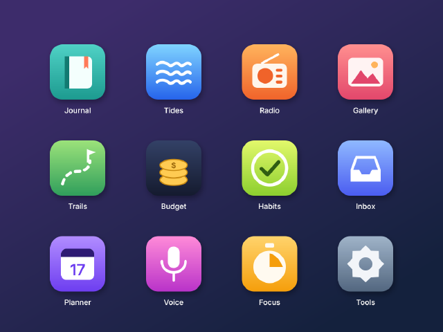
App Icon Grid
Twelve rounded-square app icons for a fictional suite, with gradient fills, soft shadows and simple vector glyphs on a home-screen grid.
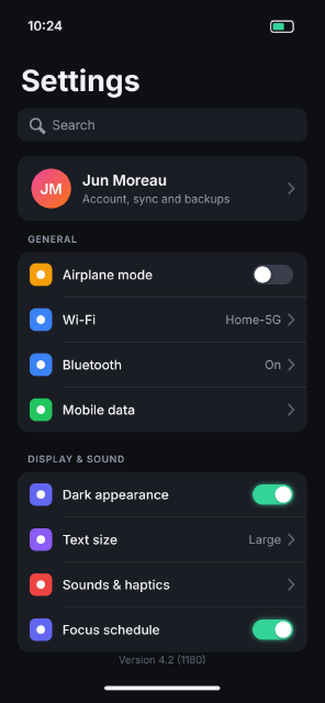
Dark Mode Settings Screen
A dark-theme phone settings screen at 375 × 812 pt (@2x), with grouped list cards, toggles, values and chevrons.
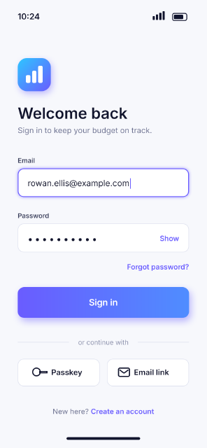
Mobile App Login Screen
A sign-in screen for a fictional budgeting app at 375 × 812 pt (@2x), with fields, a gradient button and grouped sections.
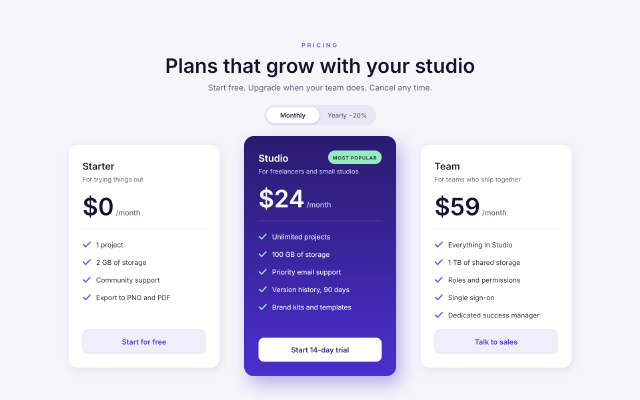
SaaS Pricing Table
A three-tier pricing section for a web page, with a highlighted middle plan, a billing toggle and checkmark feature lists.